YA book covers are endlessly fascinating to me - I never miss Cuddlebuggery's Hot New Titles Roundup, and when I see the words 'Cover Reveal' in a tweet I leap upon that link like a cat pounces on a catnip treat.
Part of the fascination is knowing just how much work goes into the creation of a piece of cover artwork and how it can easily go horribly wrong instead of wonderfully right. I think a lot of people share this interest with me, so today I'm going to try to take you through the process of creating a cover - specifically the wonderful cover of the first book in The Name of the Blade Trilogy: The Night Itself.
Before I start - many thanks must go to Lovely Lass and Delightful Designer of Walker Books (aka Hannah and Maria) for predicting that I would want to write this post and getting hold of loads of interesting material for it without my even having to ask. Extra special thanks to Maria for putting up with - and even replying to - such adorable craziness as me emailing at eleven at night, efferverscent with excitement over an idea that had come to me while watching someone construct a gingerbread Big Ben on The Great British Bakeoff (don't ask). Thank you also to Andrew Archer, the artist who created the cover, for giving permission for me to publish these images here.
The Name of the Blade (or The Katana Trilogy, as it was called then) sold to Walker Books in 2011. Not very long after that I started giving my editor hints about the sort of cover art that I hoped the books would have. Though I think, to be fair, that she did *ask* me if I had any images or ideas that I would like passed onto the designer. And I did. Yes. I definitely, definitely DID.
I hasten to add that I'm fully aware that I'm not a designer or an artist, I don't have the necessary skills, and am the last person in the world who can be objective. In the past my editor has asked, on behalf of the designer, for reference photographs or descriptions of the characters, and I'm very happy to provide those, and feedback if I'm asked for it. Other than that, I stay quiet. I am sensible. I am A Good Author.
But a) this trilogy is my beloved doll-baby-unicorn-princess-snuggle-bunny in a way I don't think any other project has ever been in my whole life and b) getting a contract from my publisher for a trilogy in a new genre was a HUGE deal for me and masses of work for Wonder Editor and Super Agent, and I felt as if my whole career as a writer was now riding on the way everything turned out with this one. So I was a tad over-invested.
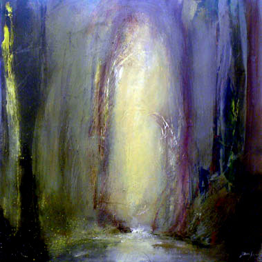
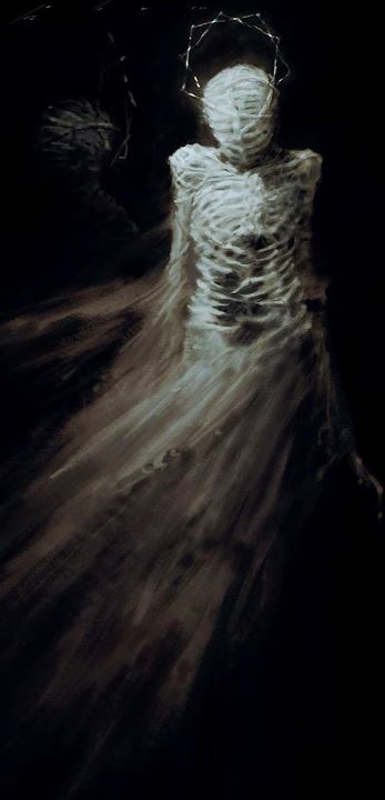
The conversation that I had with my editor about these covers was intense. I felt very strongly that the new trilogy, being urban fantasy, should have a really distinct look that would distinguish it from my other books, which are high fantasy. I probably repeated the words 'modern', 'edgy', and 'different' about twelve times each. I sent my my editor the link to the Pinterest Board which I had set up for the trilogy, a Pinboard which at last count contained three-hundred-odd pins. Here is a selection of images:

Months later I went to London to do a signing event and my editor came along, bringing Delightful Designer with her. They showed me an initial cover concept for what The Night Itself and Book #2 of the trilogy might look like. It was very rough and ready and had been made using stock images.
Delightful Designer explained the concept to me. It seemed to her that throughout the story the heroine of the book was engulfted by strange forces beyond her control - such as the power of the katana - and was constantly struggling to understand and fight free of these. DD wanted to depict this struggle on the cover. One of the mock-up covers DD showed me centred on an illustration and the other a photographic image, but both of them utilised telling details from the story, bold colours, and innovative graphic design. It was modern, it was edgy and it was different. I loved it.
Wonder Editor and Delightful Designer both warned me not to get too attached, as this was early days and the design might still go in another direction. I was incredibly excited anyway.
Not long after this Delightful Designer contacted me to say that she was briefing an illustrator and asked if I could give her a detailed description of Mio, the central character of the trilogy. This is the description I gave her:
...a small heart-shaped face, a straight little nose, and pale-ish skin. Her eyes are large and chocolate brown, with quite fine brows. She has a precision cut, slightly inverted chin-lenth bob. Her hair is straight and shiny and black.I also sent a bunch of reference photos:
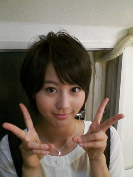
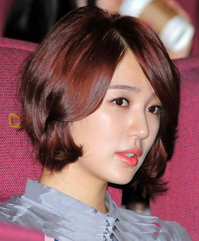
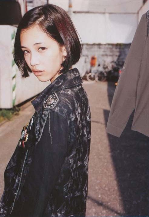
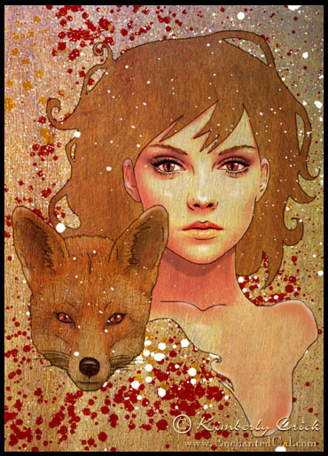
This is just a small selection! I'm sure poor DD wished she had never asked by the time I was finished. The point I was trying to get across with these was that Mio was very young, was cute and harmless looking, and had short hair. These issues were important to me because they were important in the story. Later DD emailed me again to tell me that she had been visiting museums to look at Japanese reference materials. She wondered if I had any images of the traditional Japanese creatures depicted in the story. Again, I sent a bunch, but I won't include them here because there are spoilers.
(It was some time after this that I sent my notorious late night gingerbread Big Ben email. We shall not speak of it).
Then DD went to the illustrator - Andrew Archer, who says on his website that he is inspired by Edo Era artwork - and briefed him. These are some of the sketches that he came up with initially in response to DD's ideas and the reference materials and descriptions:
I really love Mio's expression in the first one! You can see how the central design is already there, and several details from these pieces (including that awed, vulnerable expression on Mio's face) have remained the same right to the end of the process. You can also see that the artist was developing two slightly different takes on DD's idea.
The next thing that I was asked to give feedback on was a pair of fully coloured pieces of art, each of which explored one of the different takes on the cover concept further.
 |

In both versions Mio is represented with a place holder image, which is just there to show the different options of her face in profile or looking out at the viewer.
These images feature something new which wasn't on the sketches - an authentic Japanese-style rendering of a Nekomata (a cat-demon). I was a bit torn about this. One part of me thought that having the central villain of the piece right there was overwhelmingly cool, especially as the illustration could have sprung straight from the pages of a book of Japan's myths and legends. Another part of me thought, hang on - this is one of the most evil, terrible monsters I've ever written about. Its freakiness should be confined to the insides of the book, not creeping people out on the cover!
The other thing that these versions have in common (I think) is a sense of a bit too much going on. We've got a monster, a heroine, lots and lots of swirly bits, and a brush-painted font which (although really lovely) is also curvy and swirly, plus the London skyline in one version (which I take full responsibility for - I was really keen to show off the book's setting).
Despite these issues I still adored the direction that the art was going in, and especially liked the black and pink colour version, as well as Mio's face in profile. I gave that feedback, along with...er... several more reference images for Mio's face. Over the next several days. Ahem. Poor Delightful Designer and Wonder Editor...
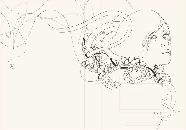
Anyway! A little while later I was sent another sketch:
Mio's face popped out at me immediately. It was HER. And it was reminiscent of Alphonse Mucha's famous paintings:
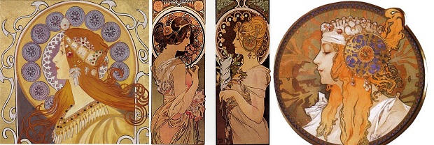 |
| I have a framed poster of the middle painting - Cowslip - on my bedroom wall. |
In addition to the Mucha-influenced profile of my heroine, the font in the new sketch was clean and minimal, with an Art Deco look. While I was sad to say goodbye to the brush-painted font, I loved the sharp, almost blade-like edges to the letters. Somehow these styles from the beginning of the Twentieth Century had magically combined to create a really *modern* effect.
Another detail that really pleased me: the graphic elements strangling Mio. They are clearly inspired by both historical and contemporary Japanese depictions of demons, serpants and monsters. LOVE.
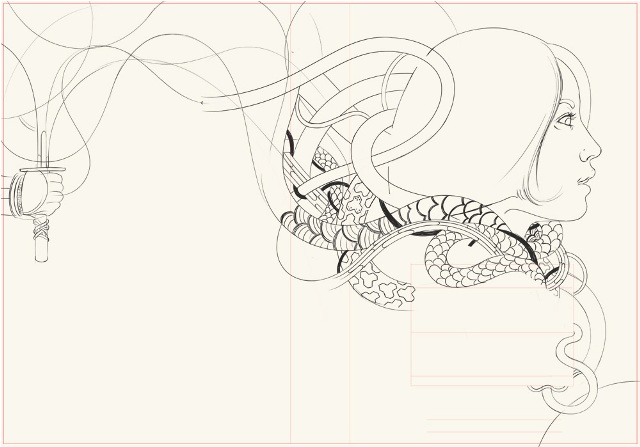
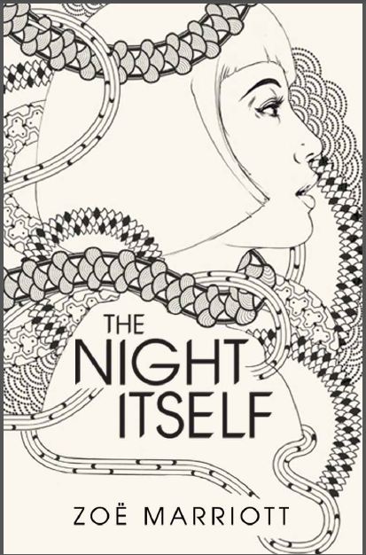
And then finally, this arrived:

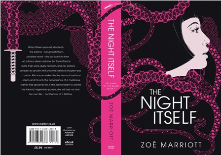
I think what makes this design so special for me is a combination of detailing - things like the way the black bands of energy snake across the vivid pink block of the spine, the tiny katana above the title, and the accurate depiction of the tsukamaki (silk wrappings on the katana's hilt) on the back cover - and that enigmatic, vulnerable look on Mio's face. She's so like I imagined, and yet I can't quite work out myself if she's awed, scared, happy, detemined or sad. Ambiguity = one of my favourite things.
This cover = my favourite thing in the world ever at the moment. And this is how it was made :)
For more insight into how cover art is designed, check out Ruth Warburton's wonderful post, which showcases the process that lead to the lovely trilogy look for her Witch In Winter series.
19 comments:
Such a beautiful cover and fascinating to see how it all came together :)
Every time I see this cover, I get shivers up my spine. It is SO beautiful. I loved finding out how it all came to be – thank you for sharing!
Essjay: Thanks! I'm endlessly fascinated by this process, so I hoped other people might be interested too.
Emma: Oooh, best comment ever! Thanks, hun :)
When it was time for the cover of Child of the Hive, I had very little idea of how I wanted it to look. The designer went off with little more than the synopsis and blurb and came back with 12 very different designs.
I hated all of them.
Several emails and a couple of phone calls later, we had a long talk about what I liked or didn't like in the various designs and he went away again. He then came back with something I quite liked.
A few exchanges later, there was something that I really liked. One final tweak and I loved it.
It was an amazing moment when I saw the final cover design and new that it was perfect. I think it was made all the more powerful because I'd had that moment of despair when I'd seen all the cover designs and thought they were awful.
Jessica: I must admit that my first sight of those (rather scary) placeholder faces made my delight in the finished product, with the beautiful profile of the heroine, much sweeter!
It's lovely - I love Walker's book covers - they spend a lot of time working it out. Having sat in on their creative person's talk through of another cover, it's incredible to see how much thought goes into each thing.
She is lovely - cannot wait for the book. Congrats again, pal!
Liz: Thanks! It is amazing the effort that goes into this process, especially when, like in this case, they do an illustrated cover which requires bringing in an outside artist. It's quite humbling, really!
wow! I thought that published authors had no say in the design process at all! it's so cool how it works. great post :)
Sam: Generally that's true! I've never been this involved in the process or been given this much opportunity to offer feedback before myself. I give full props to Maria, the designer, for not only encouraging my input, but putting up with my wild enthusiasm and freak-outs!
Wow, this is really interesting! I love the cover even more now that I know how it all came together. XD
Mucha's name sprang to mind as soon as I saw last week's cover reveal.
Stunning!
Rachel: Yay! That was the idea :) I remembered seeing a post on a design blog about the development of Karen Mahoney's THE IRON WITCH cover art, and it intrigued me so much that I really fell in love with her cover.
Rhia: Well spotted! Actually I'm amazed at how many people picked up on the Art Nouveau and Art Deco influences before I ever said anything - everyone's so art savvy!
My grandfather is an author, and he has written one standalone book, and is working on a series of 6 books, 4 of which are out. My mom has done cover designs for all of them, and now he's talking to me about possibly helping make book trailers. He's self- published and his books are mainly only available locally (Decatur, Georgia, USA) and on Amazon, but it's still been pretty cool to be so close to that process.
I love this behind-the-scenes peek at how your cover came together. It really is just a nice piece of art.
I LOVE the Nekomata in that early jacket but agree with you that there's too much going on for a book cover. And while I like the brush font, I think the final font is much more modern and subtle - because it's cleaner and because of the blade-like edges.
Eee, I just love all the design elements of your cover! Congrats again!!
Krispy: Thank you! I totally agree about the font and the nekomata. Part of me was so sad to see them go - but the final result completely justifies that.
This post was fabulous!!! I'm in love! <3
I'm doing a big cover reveal post tomorrow, and guess what? You're in there!
A Backwards Story: Oooh, thank you Bonnie! Will you please tweet me a link? If not I'll just stalk your blog aaaaaall day long :)
This is so cool to read about! It's wonderful that you got to be so involved in the process. I love novel pinboards, too. : ) Great post!
Post a Comment